
KenPom-style ratings estimate how strong a Division I basketball team is by tracking the points it scores and allows per possession, adjusting those rates for the quality of the opposition, and reporting the result as an adjusted efficiency margin. That margin is a forecast of how a team should perform against average competition, not a record of what it has already done.
That distinction is the whole thing. A team can be 24-4 and mediocre, or 14-9 and excellent, and the ratings will tell you so. Here is how the pieces fit together, in the order the calculation actually runs.
Table of Contents
- What Are KenPom Ratings?
- Why Possessions Instead of Points Per Game?
- How Does the Opponent Adjustment Work?
- What Statistics Feed the Ratings?
- How Are Offensive and Defensive Ratings Calculated?
- How Do You Read a KenPom-Style Ranking?
- From Rating to Prediction
- What the Ratings Do Not Measure
- Frequently Asked Questions
- Conclusion
What Are KenPom Ratings?
A KenPom-style rating is a measure of team strength built from points per 100 possessions, adjusted for opponent quality and then compared against the national average. The output fans see most often is the net rating, or adjusted efficiency margin, which is adjusted offense minus adjusted defense.
- Adjusted offense (adjO) — points scored per 100 possessions, adjusted to average opposition. Higher is better.
- Adjusted defense (adjD) — points allowed per 100 possessions, adjusted to average opposition. Lower is better.
- Adjusted efficiency margin (AdjEM) — adjO minus adjD. This is the number the ranking is built from. Higher is better.
- Strength of schedule (SOS) — how hard the opponents on the schedule were. Higher is harder.
Ken Pomeroy built the system as a side project from his day job as a meteorologist, and it has become the reference point other analytics lean on. Most sites calling something “KenPom-style” are running the same public logic: possession-based rates, opponent adjustment, recency weighting, and a predictive output. Sites that use these ratings include KenPom.com itself, bracketologists, and simulation models that seed their projections from adjusted efficiency margin.
Why Possessions Instead of Points Per Game?
Points per game rewards tempo. A team that runs 72 possessions a night gets about 15 more chances to score than one running 62, so raw scoring totals mostly describe a team’s coach rather than its talent.
Ratings therefore work in points per 100 possessions, which normalizes for pace. Here is the same idea in raw form: a team that scores 75 points on 60 possessions is producing 125 points per 100 possessions, while a team that scores 75 on 75 possessions is producing 100. Same score, completely different quality of shot generation.
| Team | Points per game | Possessions per game | Offense per 100 | Defense per 100 | Record |
|---|---|---|---|---|---|
| Fast pace | 78.0 | 72.0 | 108.3 | 101.4 | 21-9 |
| Slow pace | 68.0 | 62.0 | 109.7 | 97.5 | 21-9 |
| Balanced | 74.0 | 67.0 | 110.4 | 92.5 | 22-8 |
These are illustrative numbers, but the pattern holds in real data. The fast team scores ten more points a game and gets nothing for it in efficiency terms. The balanced team scores fewer points and is far harder to play against.
Why a faster team is not automatically a better team
Tempo is reported, and fans should read it, but it is not a quality measure. Two teams can run identical styles at different speeds, and a team can slow things down because its defense is better when opponents have fewer possessions. Adjusting for pace removes that noise so the rating reflects execution instead.
How Does the Opponent Adjustment Work?
Raw efficiency against a bad schedule flatters you. The fix is to rescale every game by how good the other team was: a 115 offensive rating produced against a top-20 defense counts for less than the same 115 produced against a bottom-50 defense.
In plain terms, the adjustment multiplies a team’s raw efficiency by the national average and divides by the opponent’s adjusted defensive efficiency. The result is the number of points the team would be expected to score against average opposition.
Then the adjusted game values get averaged, with more recent games carrying more weight, and that average becomes adjO or adjD. Pomeroy has described the final weighting step as iterative, where each pass re-estimates opponents using the adjusted values already computed, so the whole system settles on consistent numbers across the Division I schedule.
A simple illustration: a team averaging 118 points per 100 possessions against a schedule of mostly bottom-half defenses finishes near the same adjusted number as a team averaging 108 against a schedule stacked with top-50 defenses. The raw numbers differ by ten. The talent difference is much smaller.
What Statistics Feed the Ratings?
Fewer than fans expect. The core inputs are scoring efficiency, defensive efficiency, opponent-adjusted production, pace, and the strength of the competition. Traditional counting stats are visible in the underlying box scores, but the rating itself is built on the possession-level rates.
Shooting profile, turnover rate, rebounding, free-throw rate, and foul behavior all shape those possession-level rates indirectly. A team that never gets to the line and turns the ball over on a quarter of its possessions produces a worse offensive rating no matter how pretty its shooting percentages look.
Two things get folded in at the margin. Home court is worth a few points to the home team, and neutral-site games are handled separately so a tournament game in a third city isn’t scored as though it were a road game. Everything else — injuries, roster turnover, motivation, a hot hand — sits outside the calculation or is handled separately as noise.
What the ratings summarize versus what they add up
Ratings do not take every box score line and add them together with equal weight. Shooting percentages, raw rebounds, and assist totals are already reflected in the possessions a team takes and gives away. Counting them twice would double-count the same performance.
How Are Offensive and Defensive Ratings Calculated?
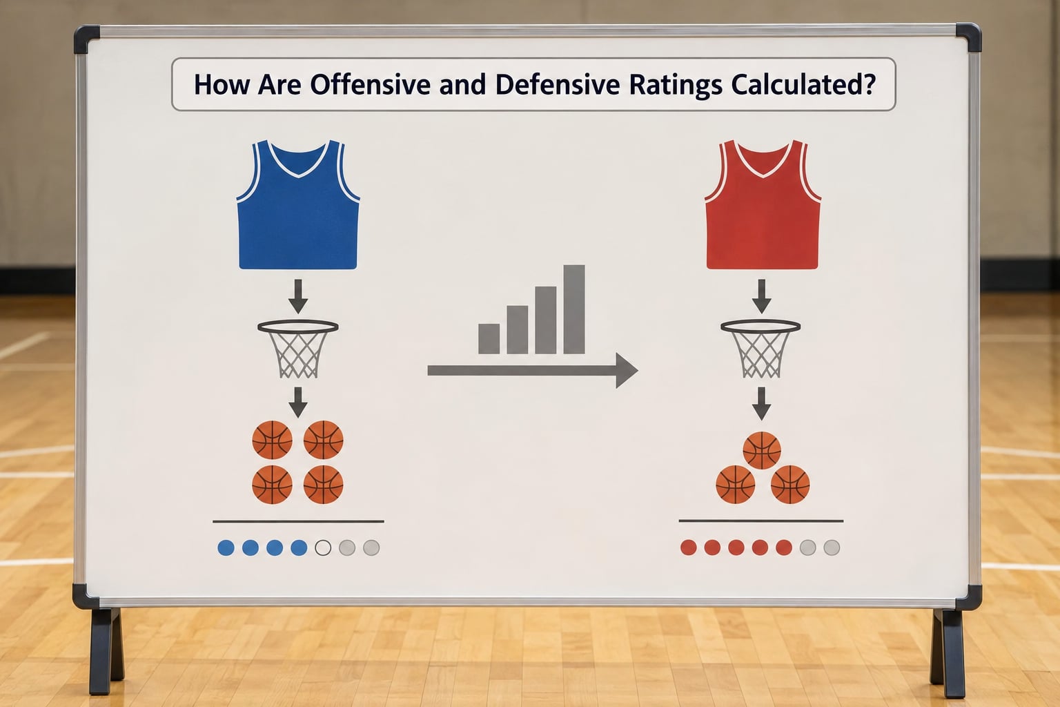
Each side of the net rating is built the same way. Start with points per possession, multiply by 100, and you have the raw rate. Apply the opponent adjustment described above, weight recent games more heavily than old ones, average across the season, and you have an adjusted rate measured on a scale where the Division I average sits at roughly 100.
Because the scale is anchored to 100, adjO and adjD read instantly. An adjO of 118 means about 18 points per 100 possessions better than a Division I average offense. An adjD of 92 means about 8 points per 100 possessions better than average defense.
AdjEM is just the subtraction: 118 minus 92 is +26. Because the two halves are adjusted against the same baseline, they are always meant to be read together. A team with a great adjO and a poor adjD ranks lower than a team that is merely good at both.
Here is the arithmetic fans can reproduce themselves. Take a hypothetical team with adjO of 120 and adjD of 100, an AdjEM of +20 per 100 possessions. If the game projects at 68 possessions, the expected margin is 20 multiplied by 0.68, or about 13.6 points. The expected score follows: roughly 82 points scored, roughly 68 allowed. Change the projected possessions to 62 and the same +20 margin becomes a 12.4-point win. Tempo changes the score, not the quality.
How Do You Read a KenPom-Style Ranking?
Read the rating, not just the rank. Two teams sitting at No. 14 and No. 15 might be separated by 0.3 points per 100 possessions, which is noise, while a gap of 8 points is enormous. Rank is a label; margin is the information.
Movement is also worth less attention than most fans give it. One game shifts a season-long weighted average by a fraction of a point, so a single win or loss against a weak opponent can nudge the ranking without telling you anything new. Large moves usually mean a coaching change, a large injury, or a change in schedule strength.
Splits matter more than the headline number. Home and road adjEM, conference-only adjEM, and last-ten-games adjEM all live on the site, and the gaps between them reveal a team’s identity. A team whose numbers fall apart away from home has a location problem, not a talent problem.
Where this fits among the other ratings
KenPom is a predictive rating. The tools the NCAA selection committee uses are built differently, mostly around results and résumé. That is why a team can sit top-10 in KenPom and land on a different line in the bracket.
| System | Type | What it measures | Used by | Main limitation |
|---|---|---|---|---|
| KenPom | Predictive rating | Opponent-adjusted efficiency margin | Fans, media, other models | Ignores résumé and results |
| NET | Committee evaluation tool | Weighted results, predictive efficiency, SOS, RPI | NCAA selection committee | Rewards the schedule already played |
| ESPN BPI | Predictive index | Simulated results from box score data | Media and broadcasts | Model details are not public |
| KPI | Results-based index | Blend of unadjusted and adjusted efficiency | Selection committee | Results-weighted by design |
| SOR | Results-based index | Win probability over team strength | Selection committee | Reflects what happened, not what is coming |
| Sagarin | Rating | Blend of predictive and results components | Widely tracked | No longer on the committee sheet |
For Arizona Wildcats fans, the practical lesson is that an unranked team sitting near the top of the adjusted efficiency board is not a contradiction. The polls and the NET reward what has already happened; the ratings estimate what is about to happen.
A short glossary
adjO — adjusted offensive efficiency. adjD — adjusted defensive efficiency. AdjEM — the net rating, adjO minus adjD. Tempo — possessions per game. SOS — the adjusted difficulty of the schedule faced. Pythagorean expectation — the win percentage a team’s scoring profile should produce, calculated by raising its scoring and allowing rates to a power in the low twos and comparing them. Luck — a separate published column measuring how far results have diverged from what the efficiency numbers predicted, used to separate repeatable performance from outlier shooting.
From Rating to Prediction
The last step turns a strength estimate into an expectation. Pomeroy’s published method takes each team’s offense and defense ratios, raises them to an exponent of about 2.37, and divides one by the sum of both to get an expected winning percentage. That expected record is then converted into a predicted margin and a predicted score.
Four steps, if you want to run it yourself:
- Find each team’s adjusted offense and adjusted defense.
- Subtract to get each team’s adjusted efficiency margin.
- Estimate the possessions for the specific matchup and convert the margin into points.
- Apply the Pythagorean expectation to the projected points scored and allowed for a win probability.
That math is why a +20 team is favored but not unbeatable. Win probability is probabilistic, and a 13-point expected margin against a top-10 opponent still loses a meaningful share of the time.
What the Ratings Do Not Measure
Small samples are the biggest limit. A team with six games of Division I data carries a rating that is mostly a guess built on a prior, and preseason ratings lean heavily on the prior rather than new evidence. Preseason numbers are informed estimates, not findings.
Injuries are not directly modeled. Rosters shift after a key player goes down, and the rating takes a game or two to catch up. Anyone asking whether the ratings factor injuries is asking the right question, and the honest answer is that availability enters through the results rather than through a dedicated adjustment.
Luck gets separated out. A team that shoots unusually well for a month can post an adjD that will not hold, so the published luck column exists to show where results and efficiency disagree. Regression to the mean is a real expectation, not a hypothetical one.
Roster turnover and coaching changes are handled as priors rather than as live variables. Pomeroy has said a new coach costs a program roughly 10 to 15 spots in the preseason ranking, which is a judgment call about uncertainty, not a measurement.
Finally, the ratings describe team strength, not accomplishment. Quadrant 1 wins, Quadrant 2 wins, non-conference wins, and overall résumés are what the committee weighs. A predictive model and a résumé are answering different questions, and treating them as rivals is the single most common misreading.
Frequently Asked Questions
What does a higher KenPom-style rating mean?
A higher adjusted efficiency margin means the team is estimated to outscore average competition by more points per 100 possessions. It is a statement about expected performance going forward, not about wins banked so far. A team with a strong rating that keeps losing usually has bad luck or a bad matchup, not a broken model.
Does pace matter when comparing KenPom-style ratings?
Not for quality. Ratings are measured in points per 100 possessions, which removes tempo from the comparison entirely. Tempo is reported so you know how a team plays, not as a mark of strength. A slow team with an adjO of 110 is scoring more efficiently than a fast team with an adjO of 108.
Why can a ranking rise or fall after one game?
Every game enters a weighted average in which recent games count more, so a single result nudges the number. A narrow move usually means nothing. A big jump is the signal worth reading: coaching changes, major injuries, and a schedule that suddenly got much easier or harder all move ratings sharply.
Are KenPom-style ratings the same as tournament seeds?
No. KenPom is a predictive rating built on opponent-adjusted efficiency. Seeds come from the committee’s evaluation tools, which weight what already happened, including Quadrant 1 wins, strength of schedule, and overall résumé. The two systems routinely disagree, and a top-10 rating with a 12 seed is normal, not a bug.
How much does opponent quality affect the rating?
Enormously. A raw efficiency number is rescaled by the national average divided by the opponent’s adjusted defensive efficiency, so the same performance counts for less against a strong defense. Schedules that feature lots of weak opponents can inflate raw numbers without changing the underlying talent much.
Can one team have a good offense and a bad defense?
Constantly, and it shows up as a wide gap between adjO and adjD. A team with an adjO of 120 and an adjD of 105 has elite scoring and merely average defense. Its AdjEM of +15 is strong but not elite, which is why the two halves are always read together rather than one at a time.
Conclusion
Start by looking at adjusted offense and adjusted defense next to each other, then check the SOS column so you know how hard that schedule was. Compare the margin against recent game film and the box scores, and treat single-week movement as noise rather than news.
Used that way, these ratings are genuinely useful evidence about how KenPom style ratings work in college basketball: a disciplined estimate of team strength, built from possession-level data and adjusted for who was on the other side. They are not a verdict, and they were never meant to be one.